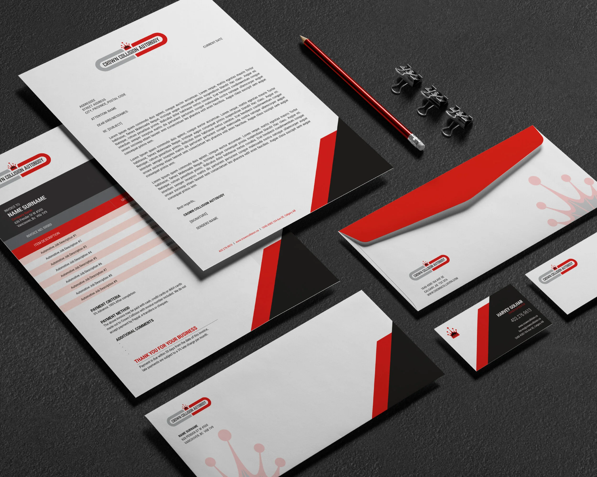
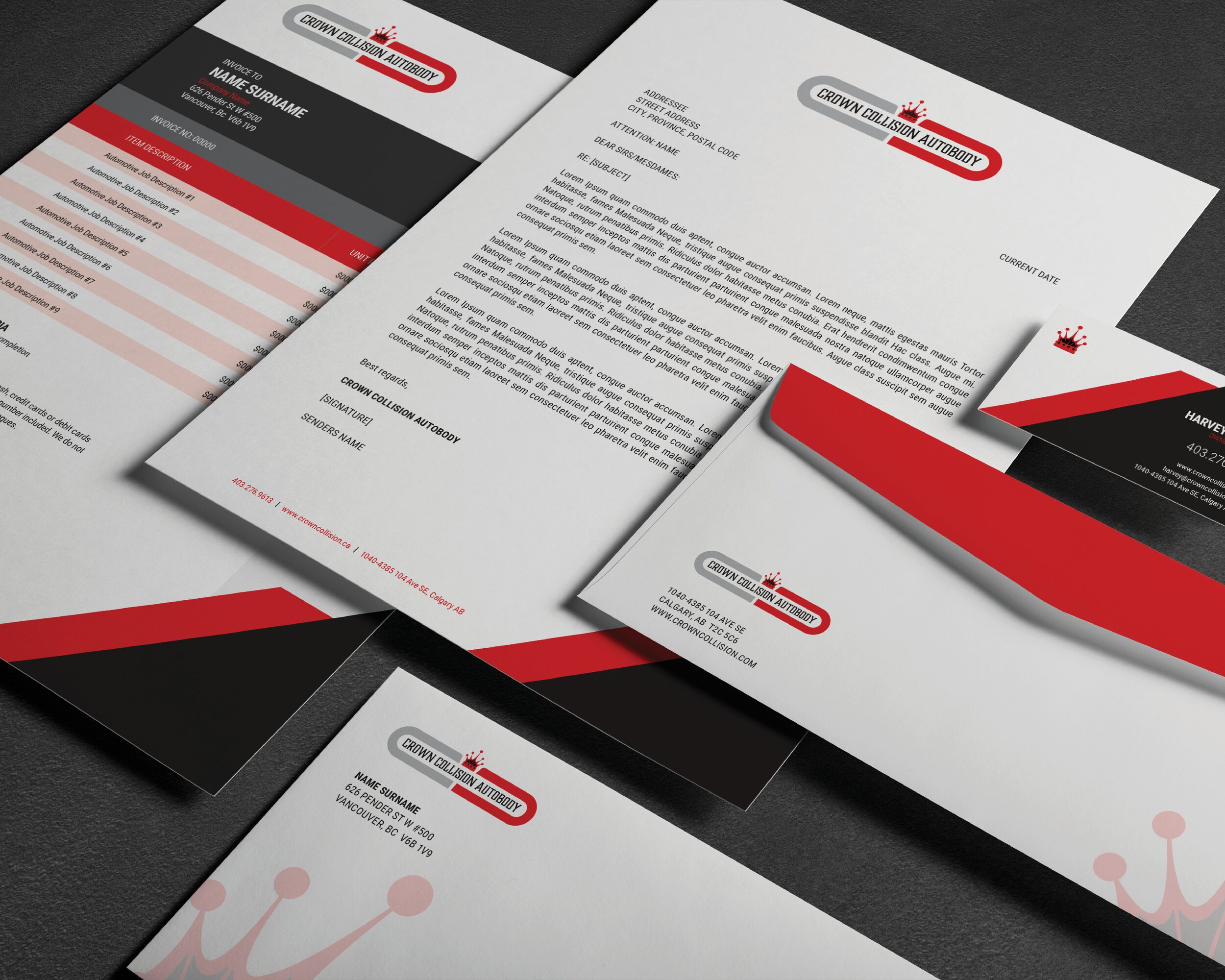
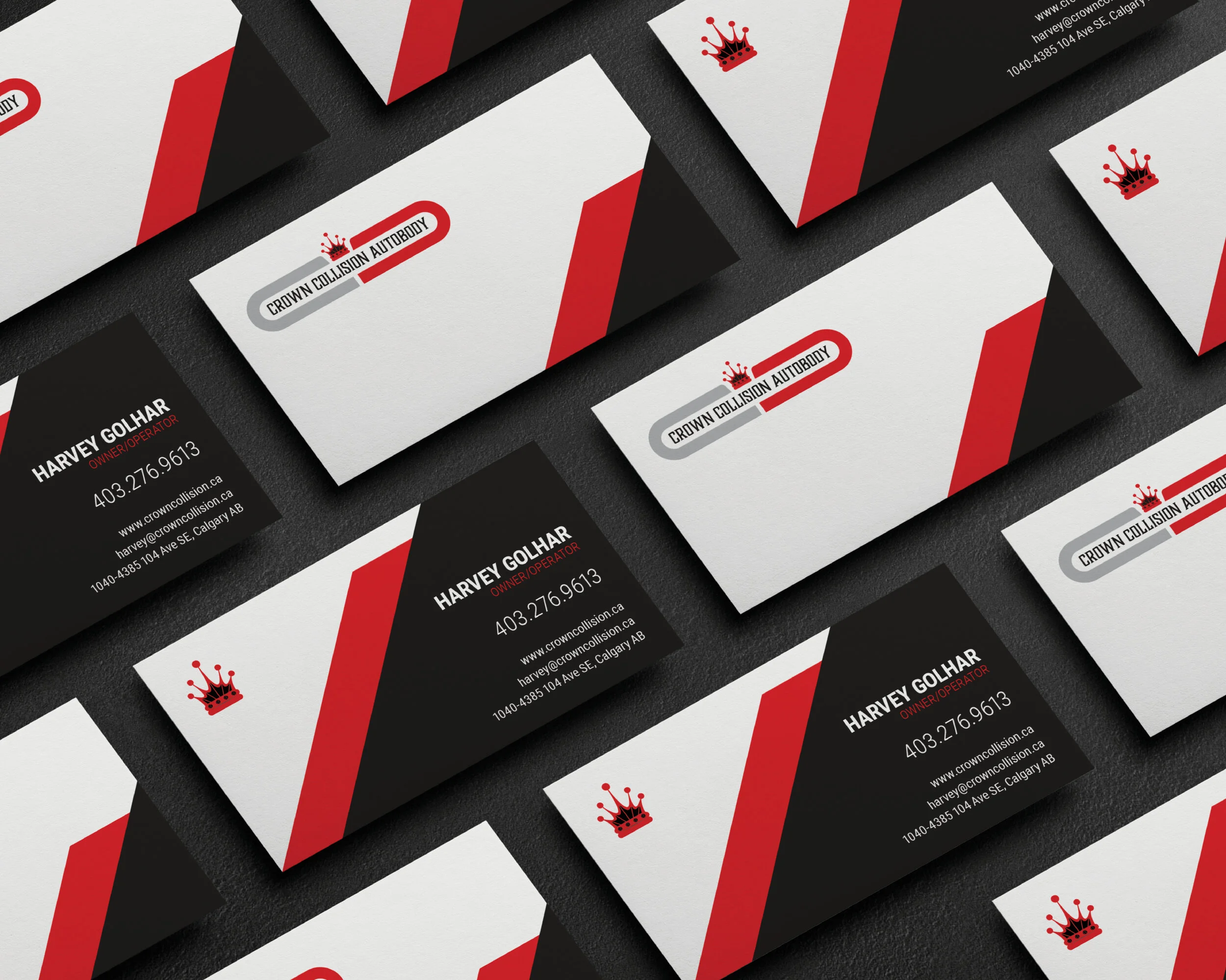
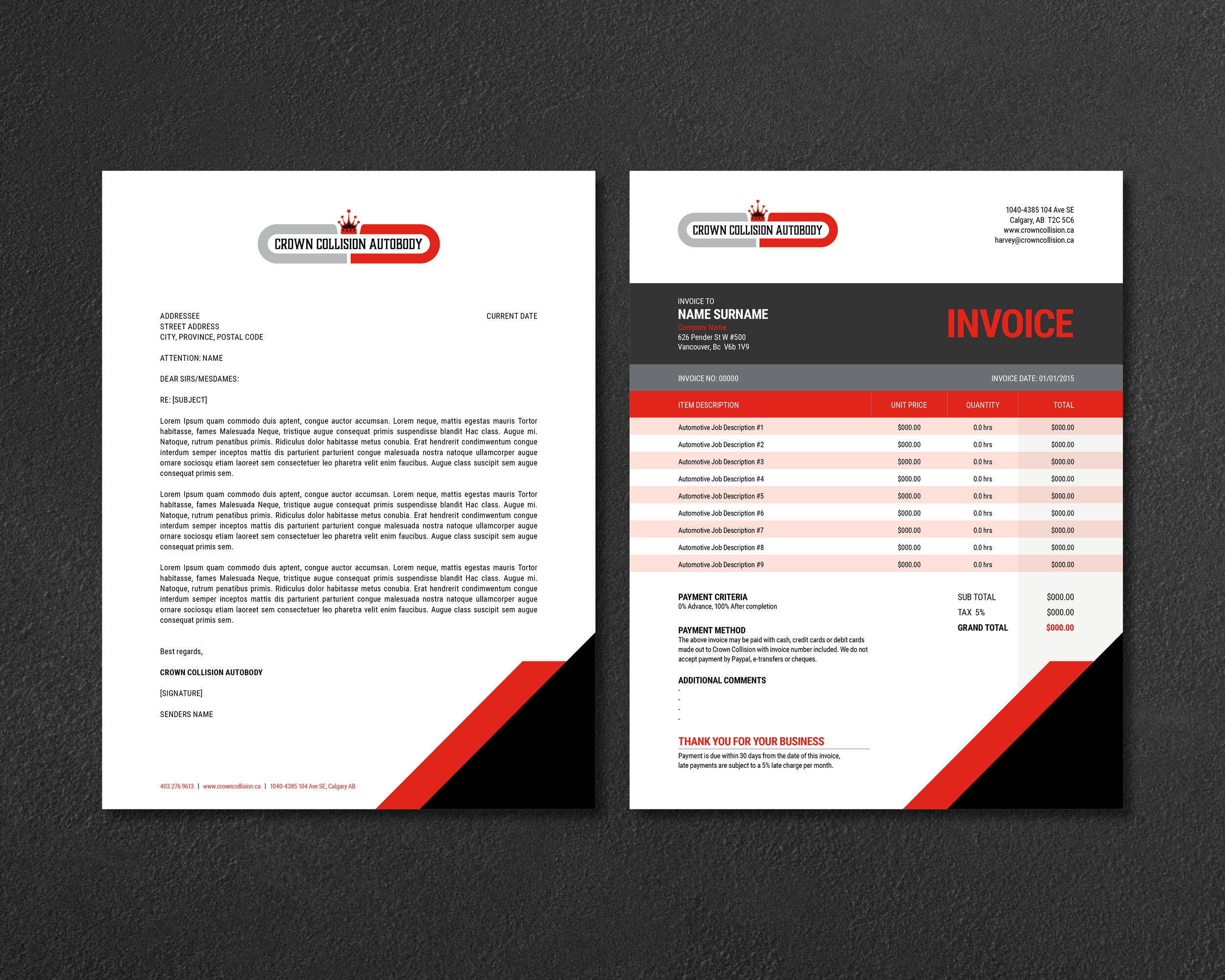
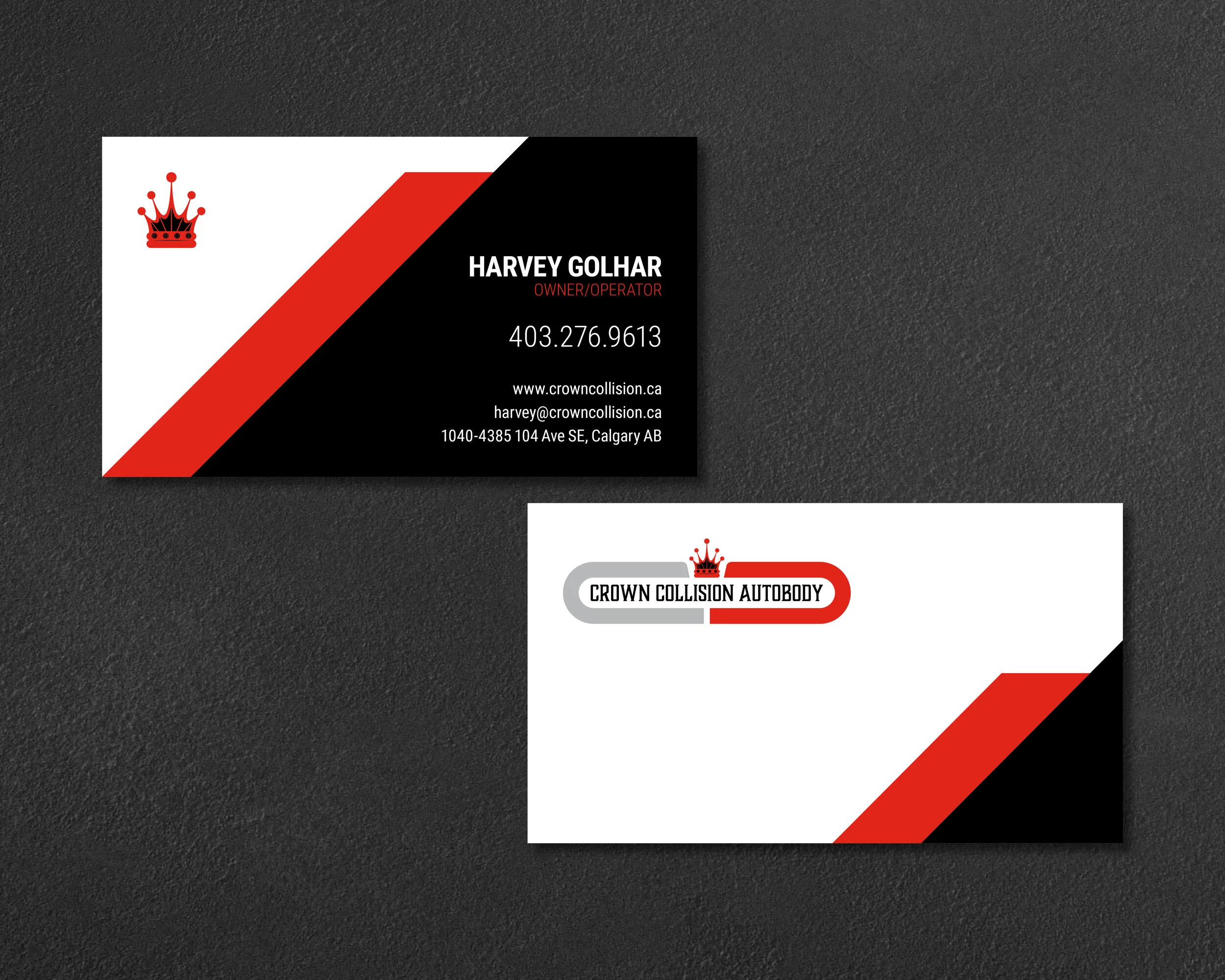
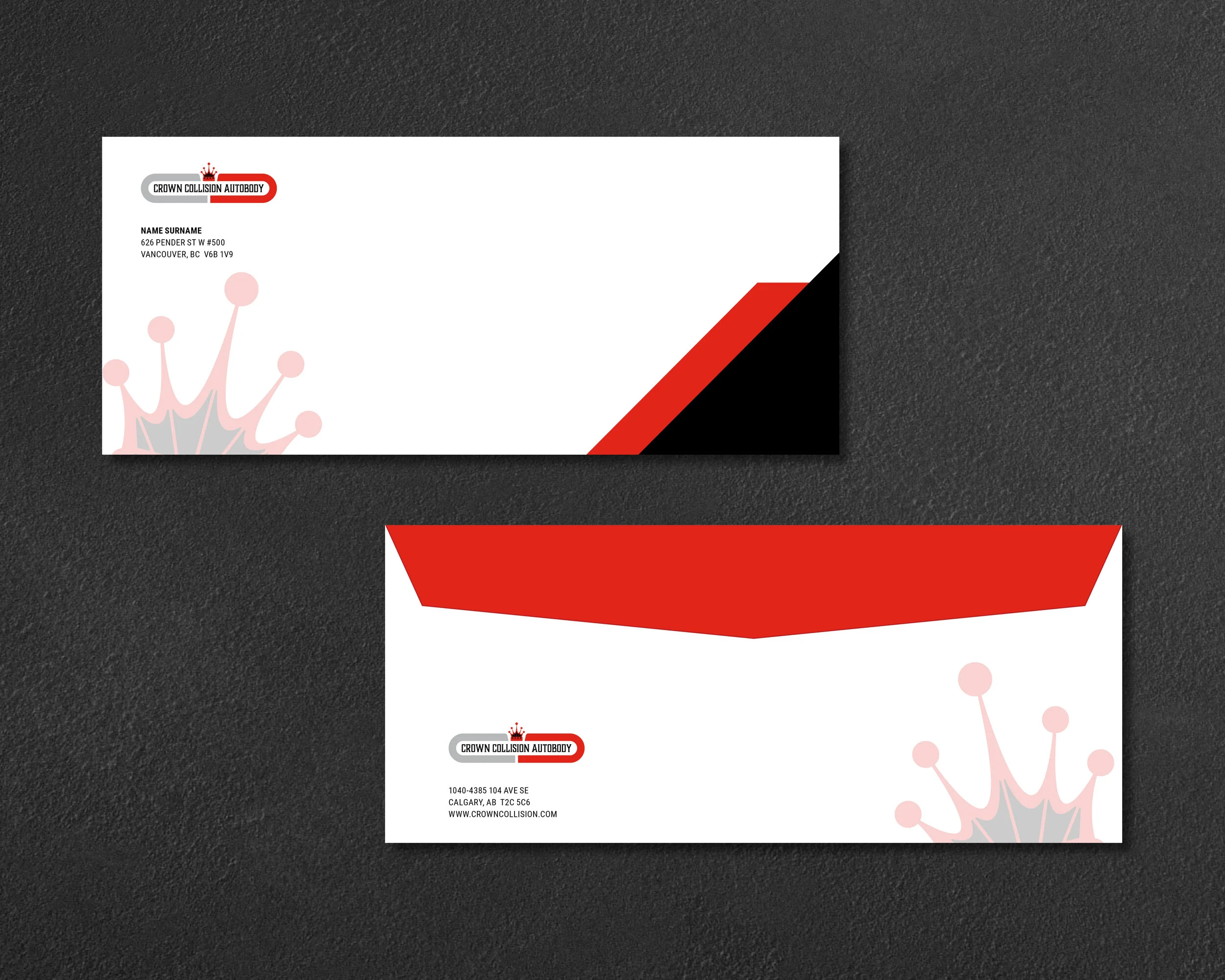
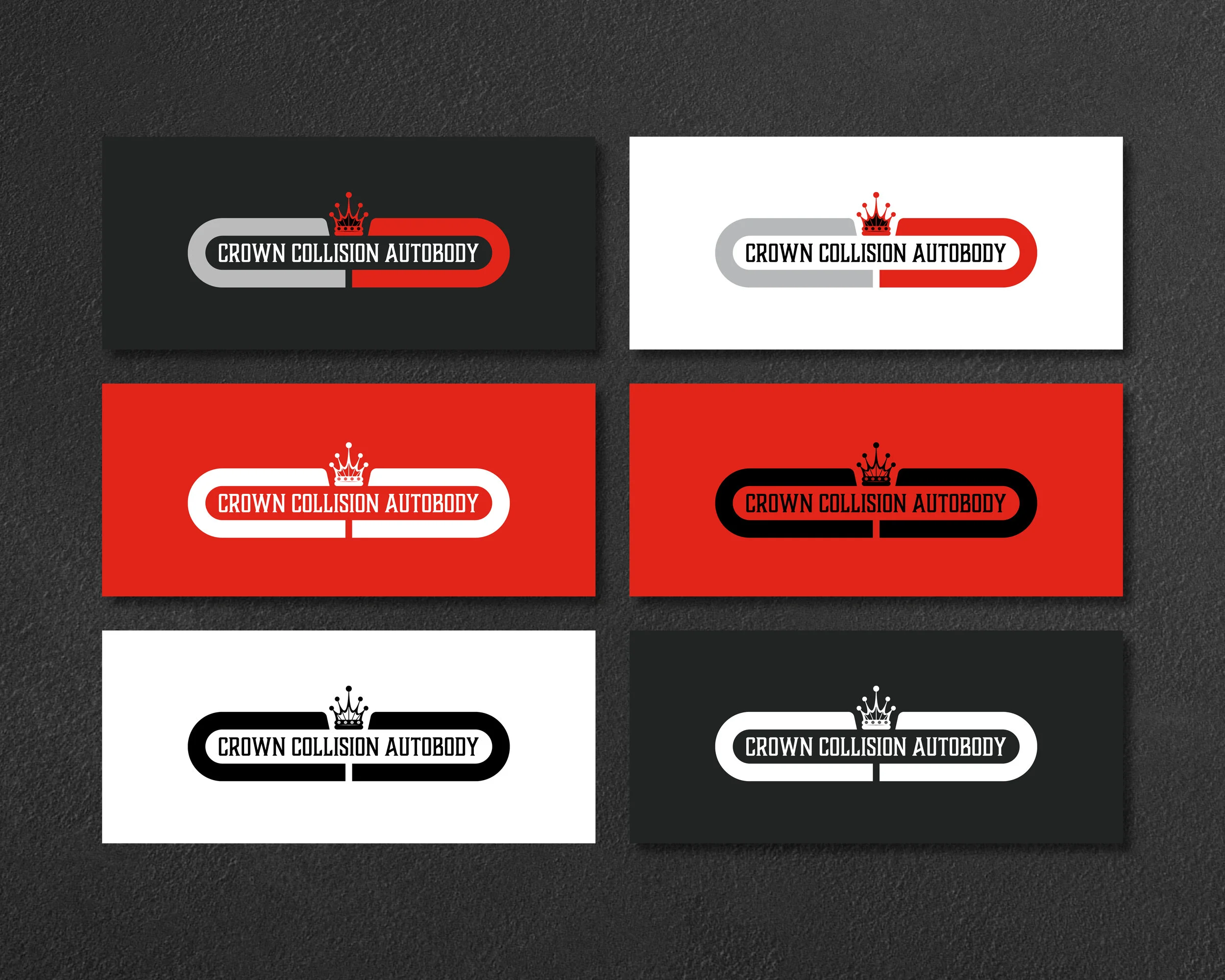
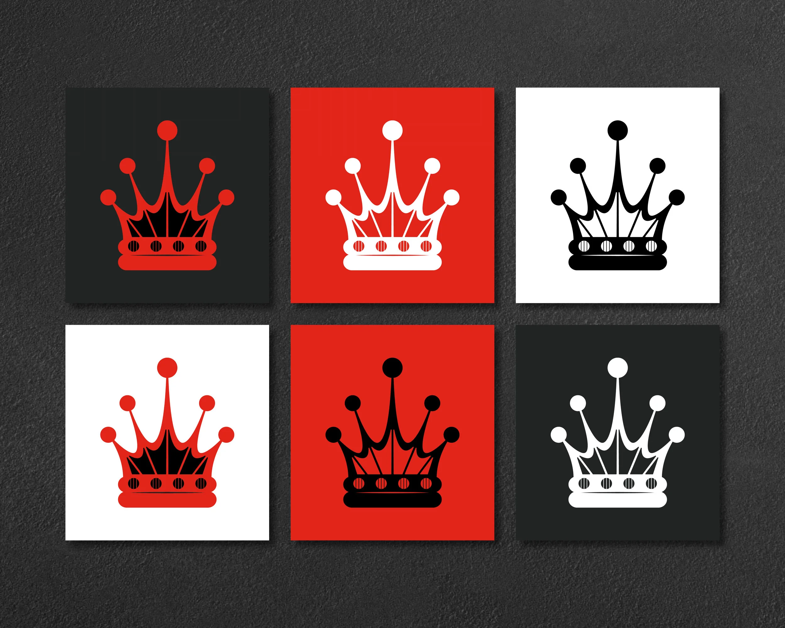
ABOUT THIS CLIENT
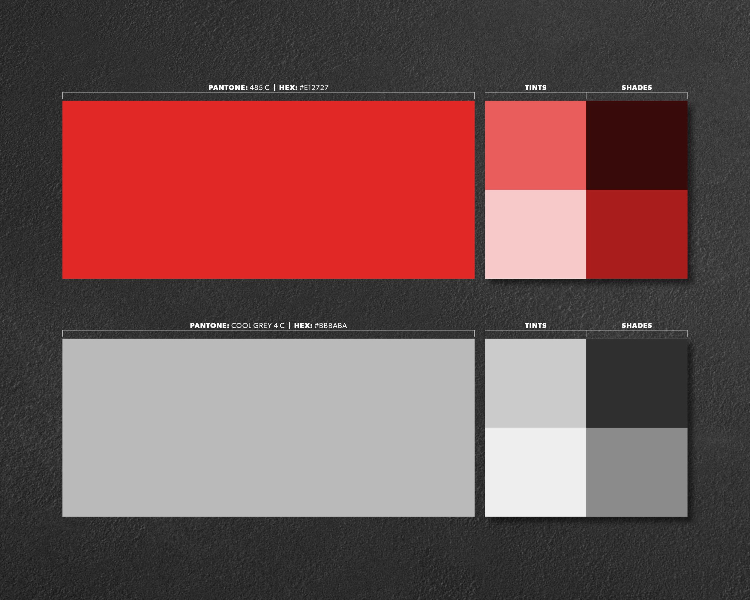
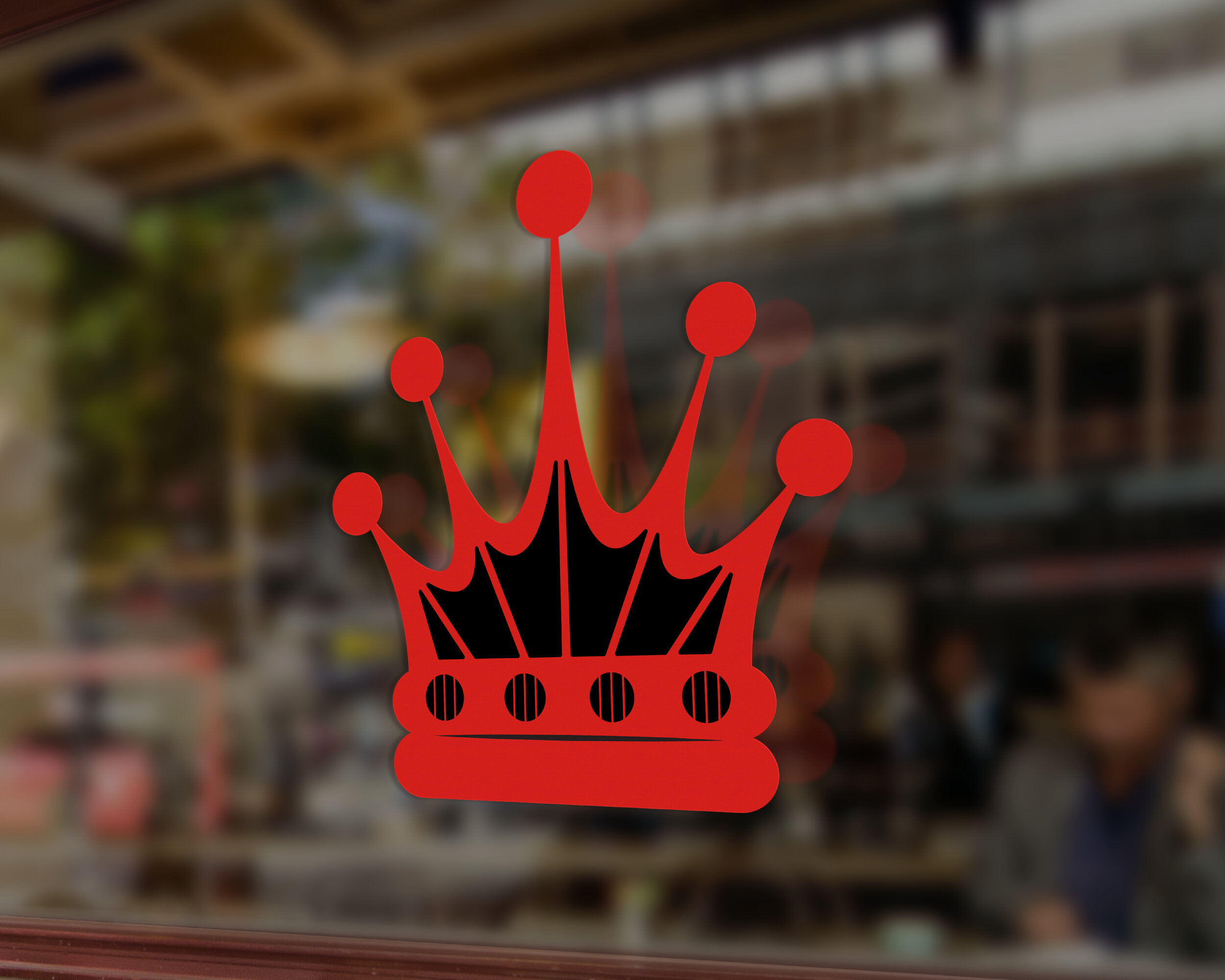
Crown Collision is a small, independent automotive repair shop in Southern Calgary that recently underwent a full rebrand. The owner, originally from the United Kingdom, wanted the new identity to reflect a modern twist on their original branding, incorporating a custom crown into the logomark. The logotype, set in bold Boucherie Block in all caps, exudes confidence and trust, helping build a strong connection with customers. The brand's color palette combines red and grey—red symbolizes high energy and strength, while grey reflects the quality and performance Crown Collision delivers with every repair.