
Product Overview
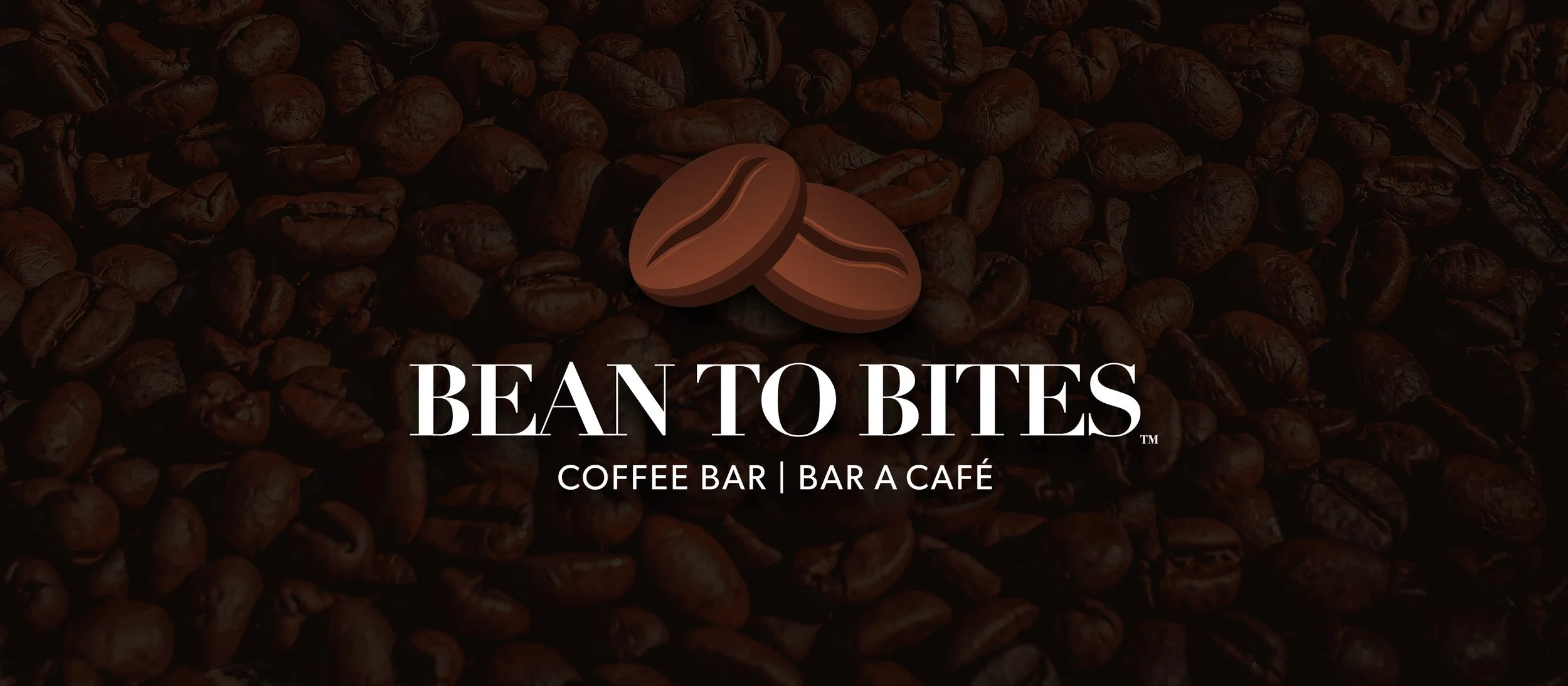
Bean to Bites is a Calgary-based startup behind the world’s first edible coffee bar, created for coffee drinkers looking for a steady, convenient energy boost throughout the day. Designed as an alternative to traditional coffee and energy products, the bars focus on clean ingredients, clear flavour differentiation, and everyday usability.
The brand required a visual identity and packaging system that felt modern, premium, and approachable, while remaining flexible enough to scale across multiple flavours and platforms.
The Problem
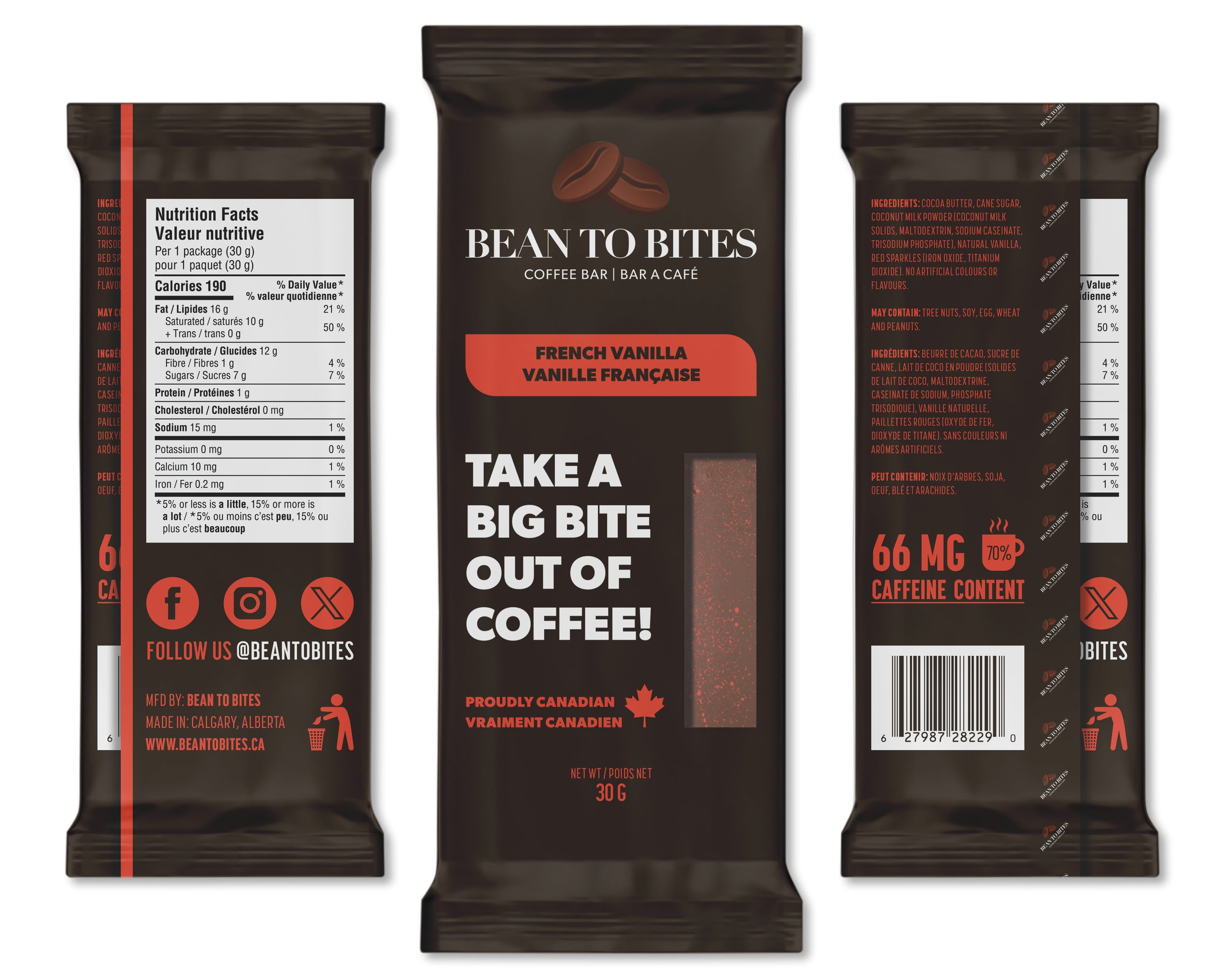
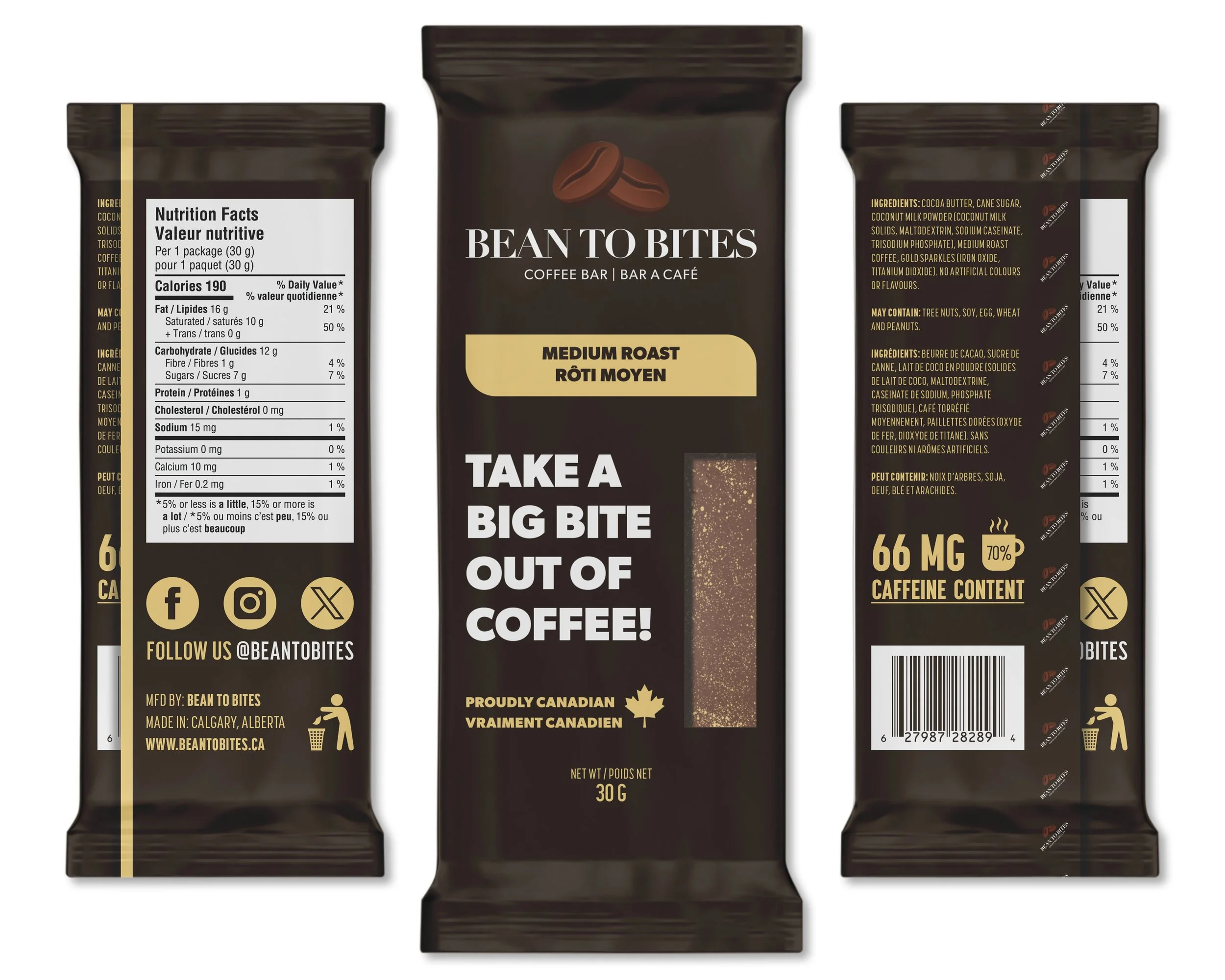
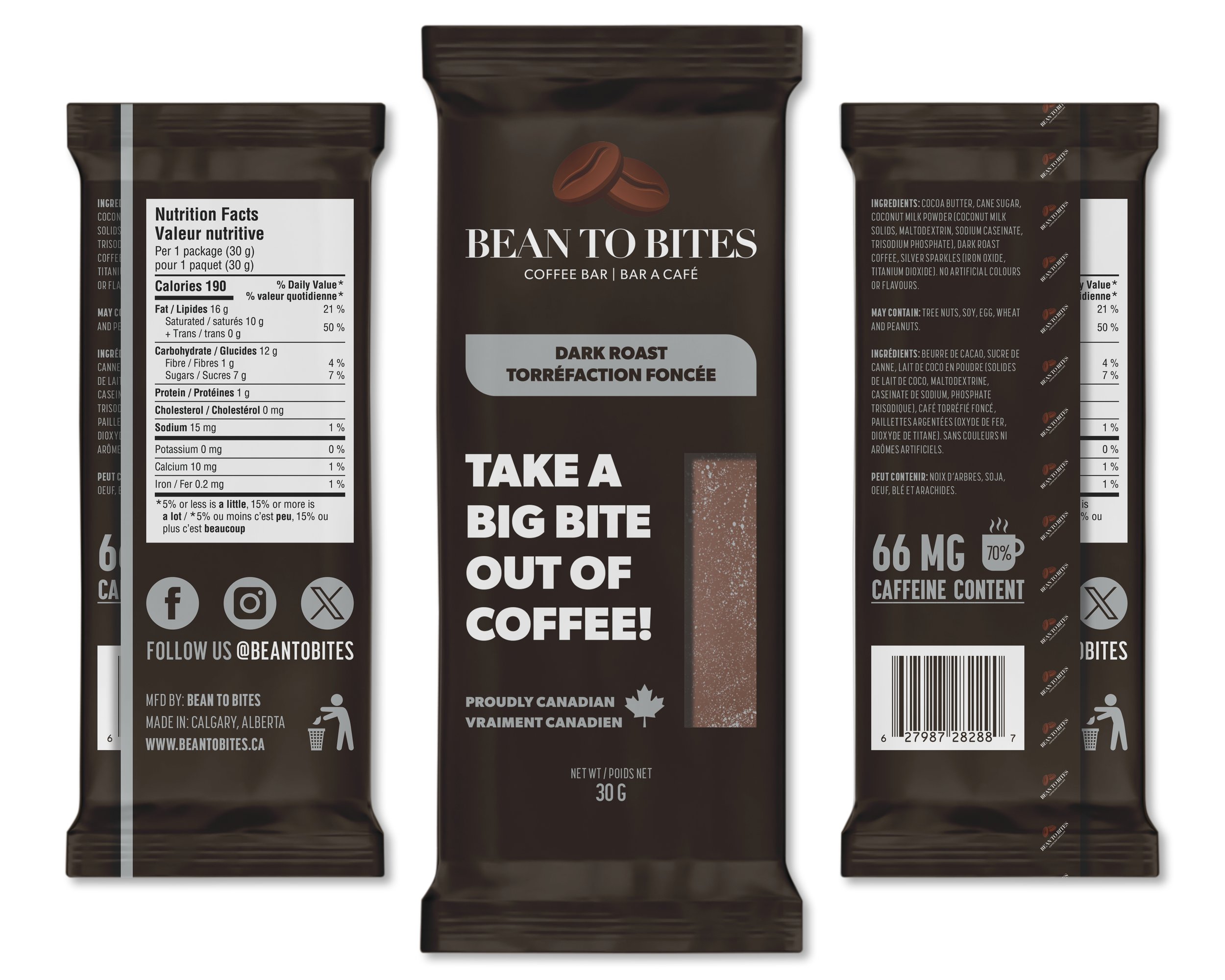
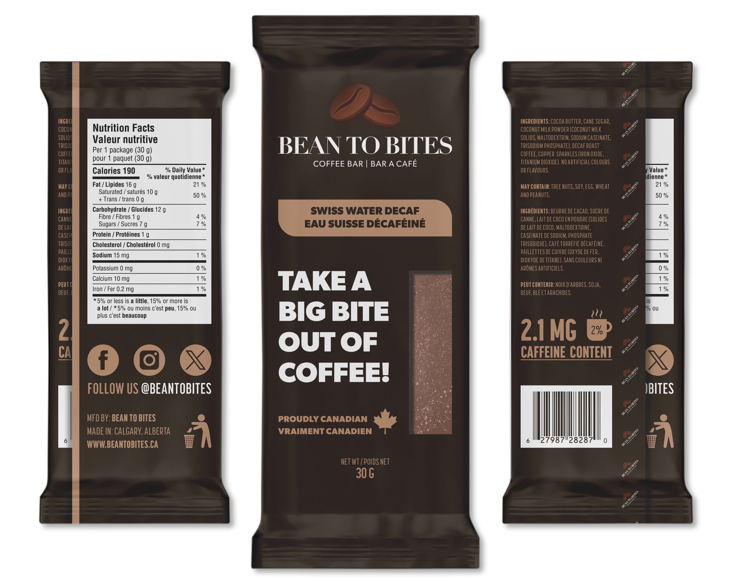
The founders wanted customers to see the coffee bars through the packaging, which meant avoiding standard foil wrappers. They had a clear vision for a matte finish and flavour-based colours, along with an early logo concept, but nothing was finalized or production-ready. The challenge was creating premium packaging with a clear window while keeping the brand clean, consistent, and ready for print.
The Solution
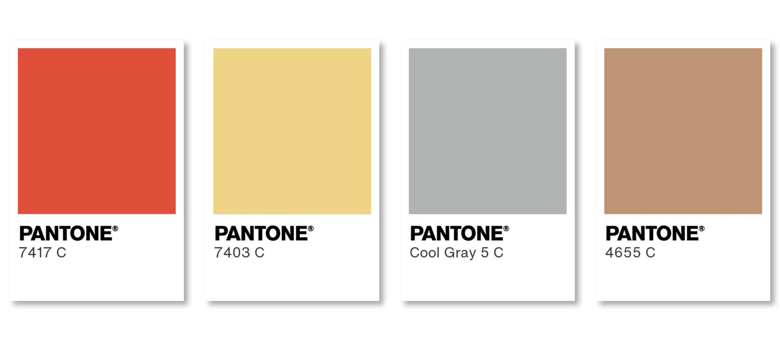
I refined and digitized the logo, then finalized the founders’ colour selections using Pantone standards. The wrapper was designed with a matte dark brown base and a clear window, allowing the product to remain visible. Flavour colours were layered in a controlled way to differentiate each bar while maintaining a cohesive brand system.
The Result
The final packaging showcased the coffee bars themselves, highlighted flavour variation, and delivered a bold, premium shelf presence. The client received production-ready packaging, a finalized logo, and a scalable colour system.
CONTACT ME
Let’s bring your ideas to life. Start the conversation and work directly with one designer focused on results.